Our world is swimming in information, so much so that we often drown in it and find it difficult to make sense of. That’s why infographics play such a valuable role. Recently I’ve come across two different sets that I thought Cultural Detectives might be interested in seeing and using (or making your own for your own purposes).
Borrowing heavily from a concept by Danish designer Peter Orntoft, the Millward Brown Agency designed the two infographics below that put data in context. Interesting, no? More memorable than otherwise?
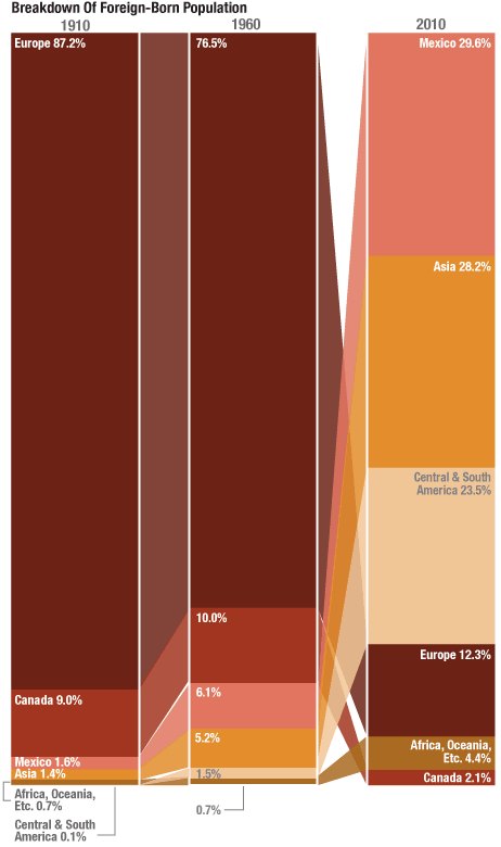
Secondly, Lam Thuy Vo of USA’s National Public Radio (NPR) created two graphics which clearly make the point that immigrants comprise about the same percentage of the US population as they did 100 years ago, though their geographic origins have changed.
Do you use infographics in your work? Please share! Have you created any? Strikes me that interculturalists could sure use this terrific approach to creating and communicating meaning.


There are great infographics! Our country is truly the melting pot of the world. We live in a society that is filled with many different traditions and cultures. Now more than ever our society needs to understand these different cutlers and backgrounds. We need to avoid stereotyping and typecasting. With so many different cultures around us, this is a great opportunity to expand our knowledge. I’m not surprised to see so many different heritages and cultures in our county. I consider myself very lucky to live in a society where I can interact with so many people from different backgrounds. Thanks so much for sharing!
LikeLike